
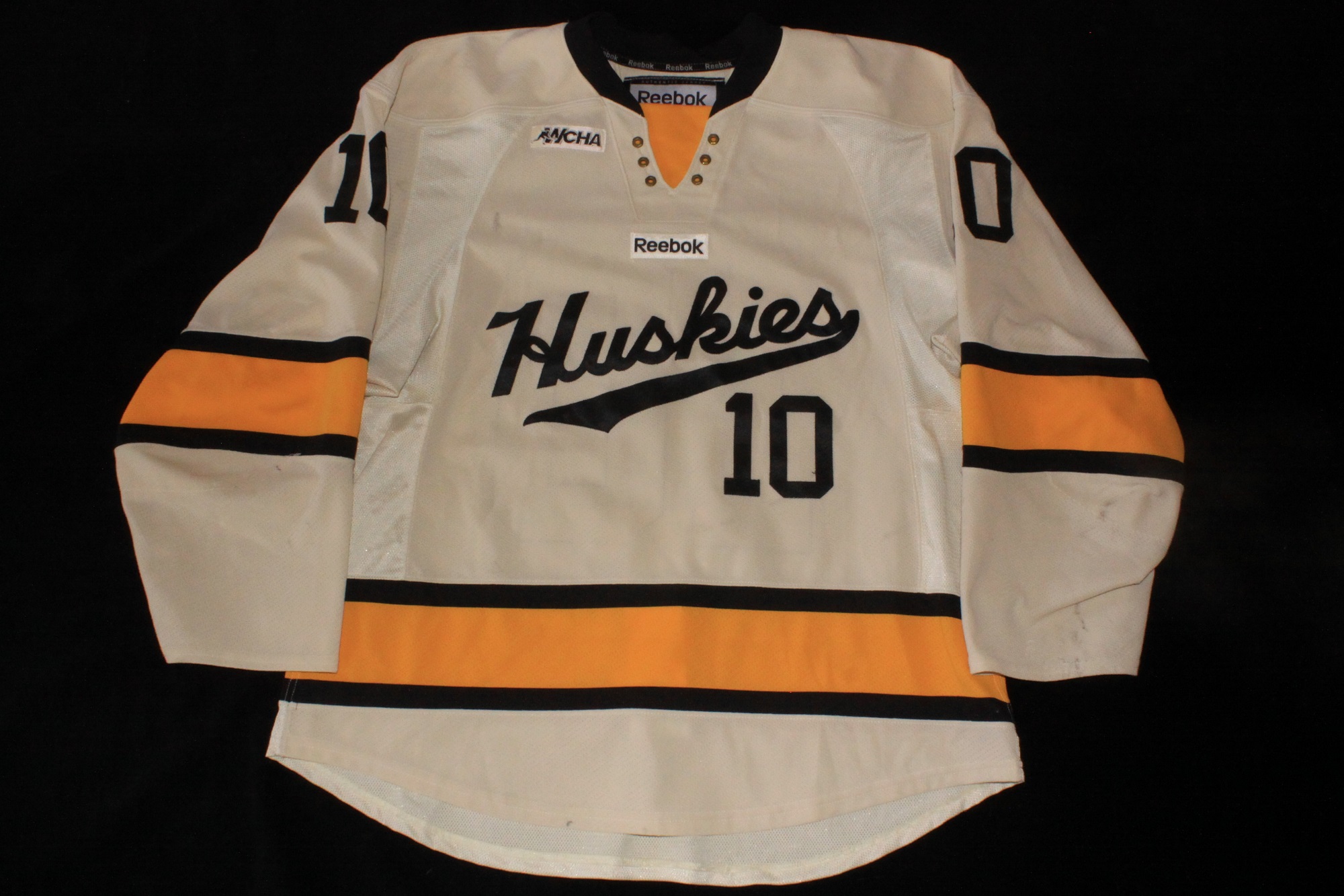
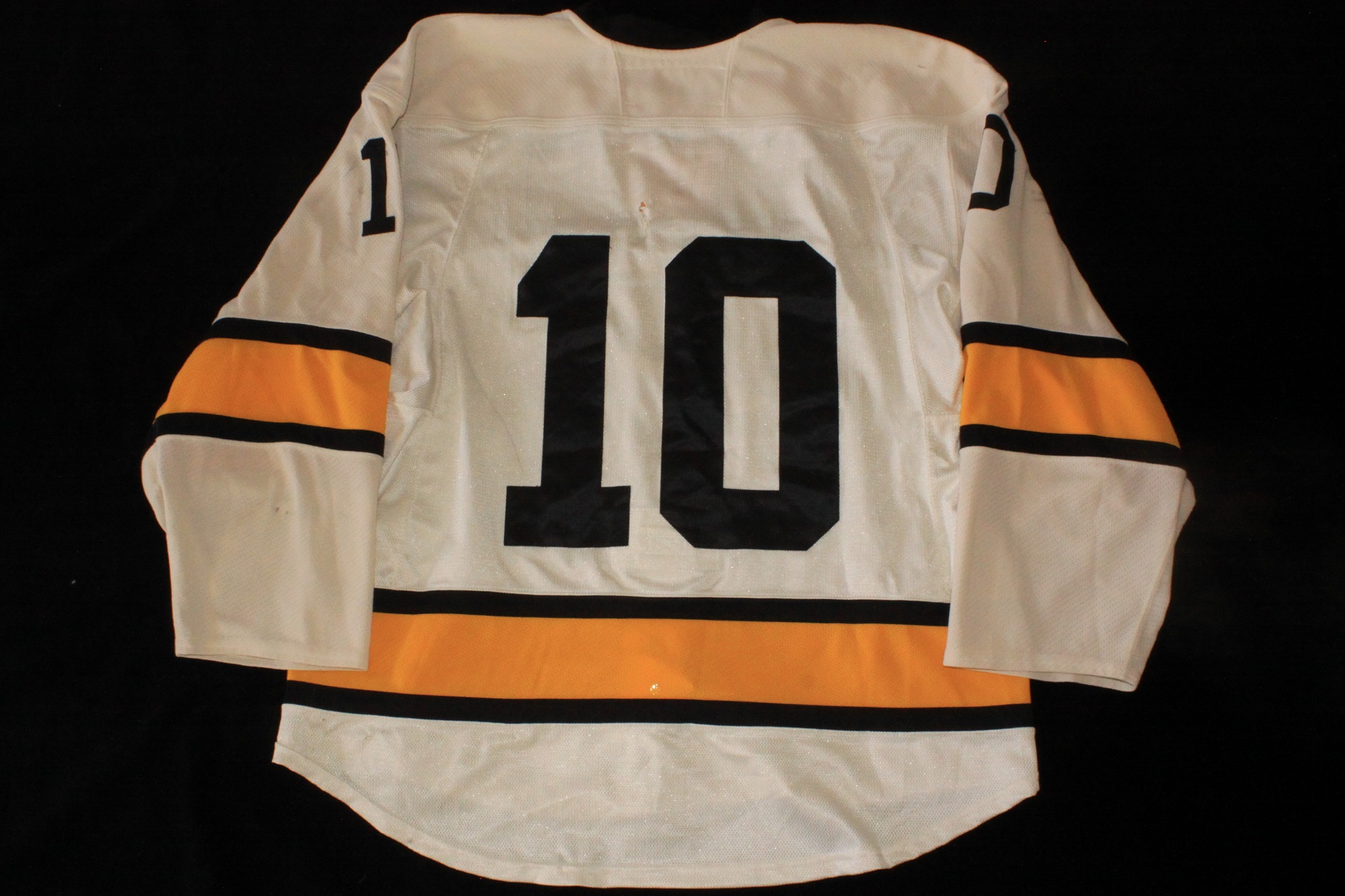
Detailed Jersey Set Notes
2008-2012
Comments:
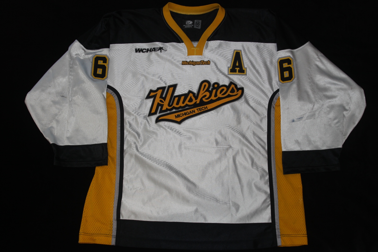
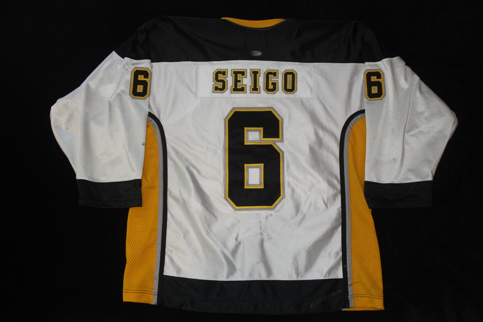
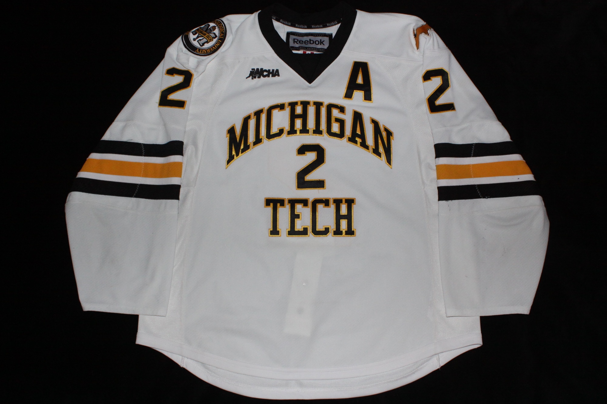
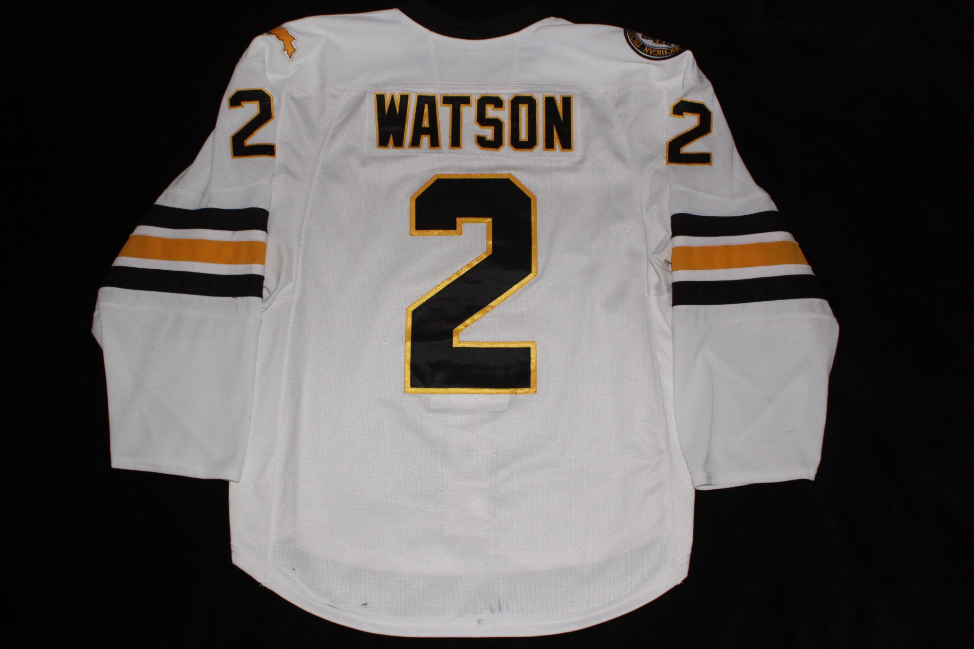
Nearly identical to the previous set of white jerseys, the only noticeable change was the addition of MICHIGAN TECH inside the tail under the front crest. OT Sports remained as the supplier. The numbers (3.75" on the sleeves and 11.5" on the back) were done in true three-layer sewn twill, however the original names were done in two-color twill with a third color edging. Replacement names added at a later date were done in three three-layer sewn twill to match the numbers.
These jerseys would have normally been replaced following the 2010-11 season, however due to the coaching changes, no new jersey sets were ordered and this set continued to acquire additional wear. While this style of jersey was used a total of four seasons, most of these jerseys were not used for this entire length of time. One obvious change to the newer jerseys that were used for replacements is the striping along the vertical body hems. In the original jerseys silver and black striping was used, however the replacement jerseys only had black striping. These newer jerseys also used true three-color twill numbers and names. The original jerseys in this set used two-color twill with a third color of edging only. Original jeseys with new namplates ended up with a mix of these two lettering techniques.
Close-up Detail Images:
Neck Tag
Goalie Tag
Wash Tag
Fight Strap
MichiganTech Logo
WCHA Logo
Back Numbers
Sleeve Numbers
Cresting
Nameplate
Alternate Captain's "A"
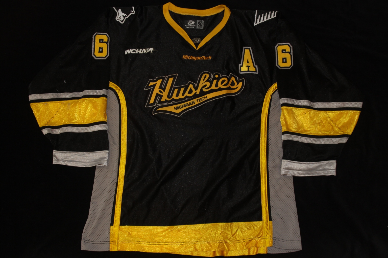
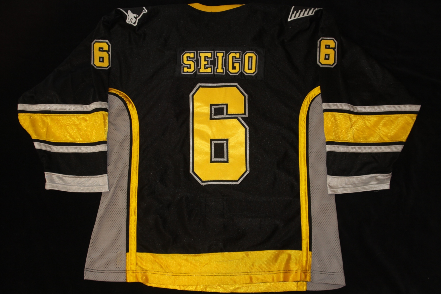
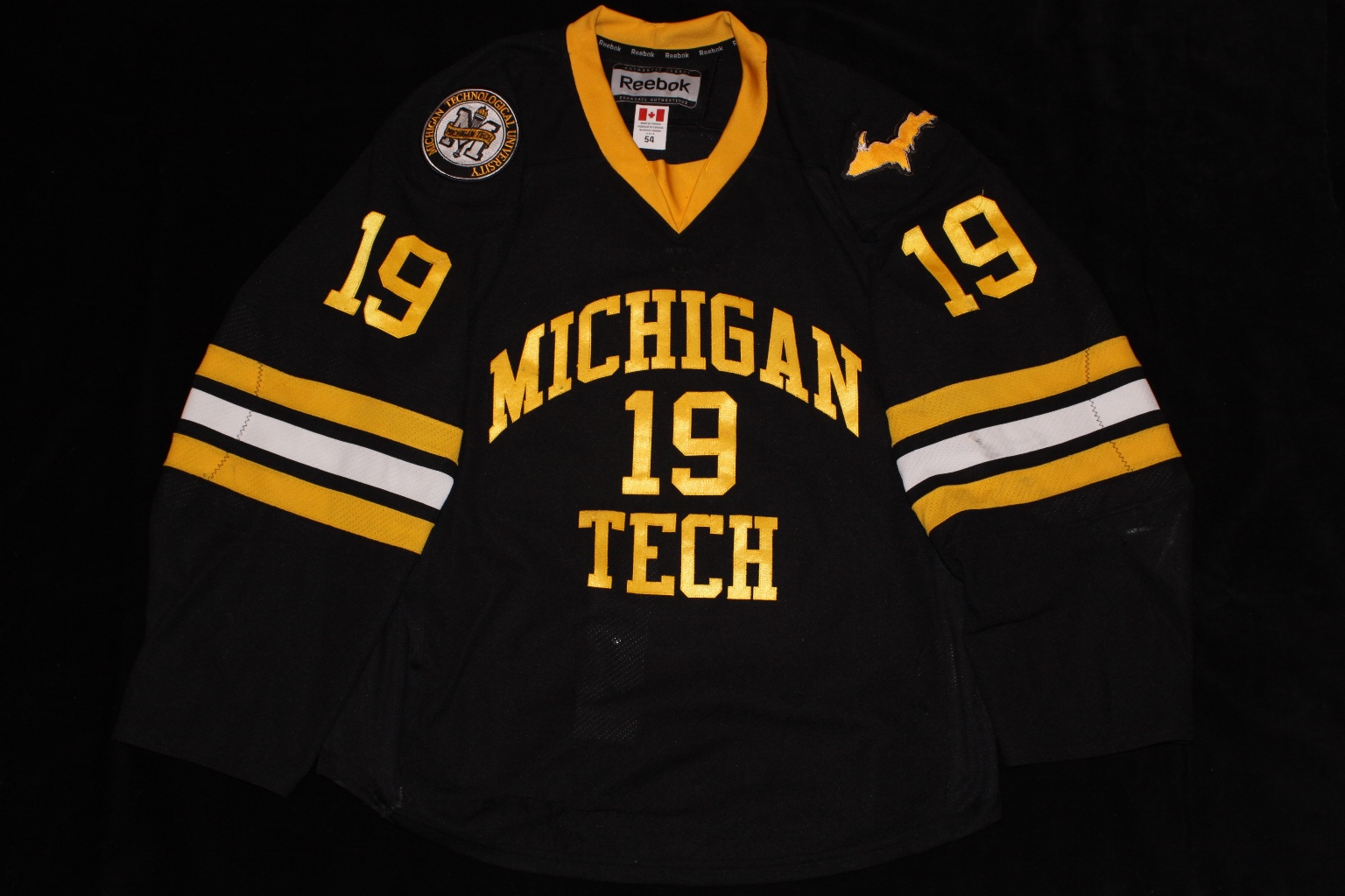
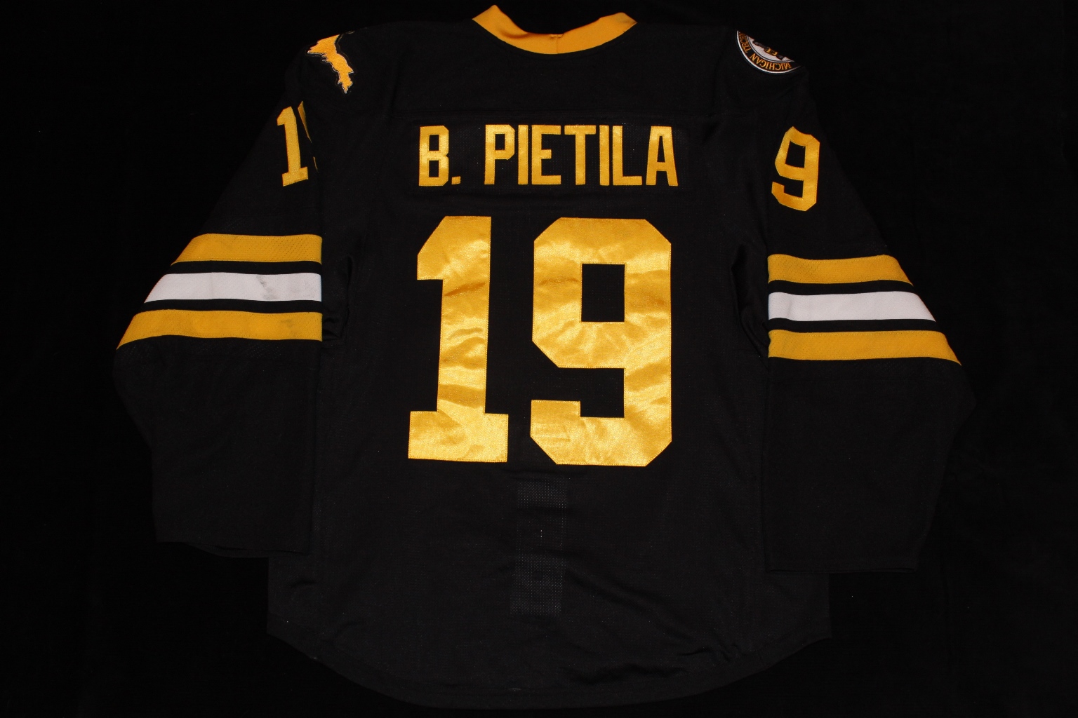
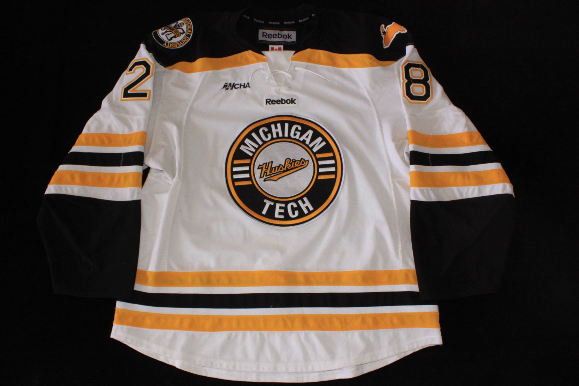
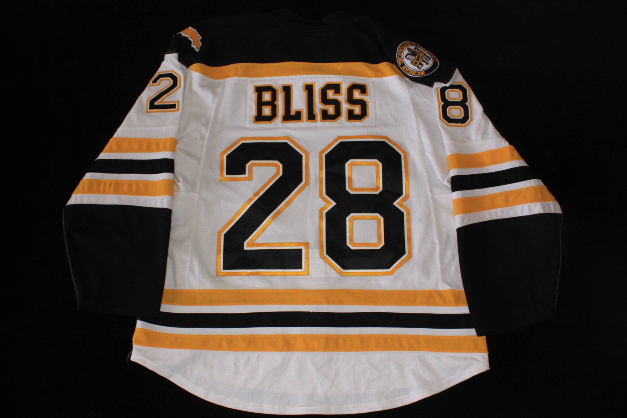
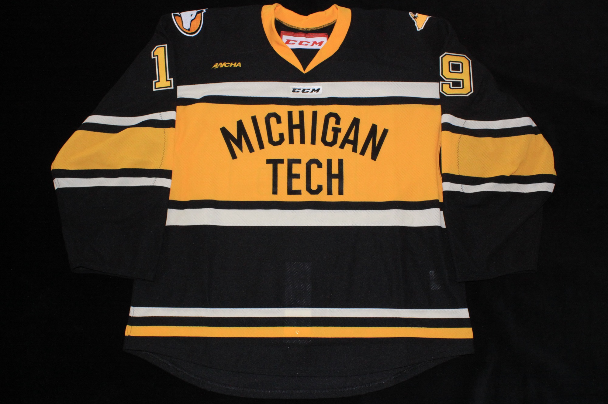
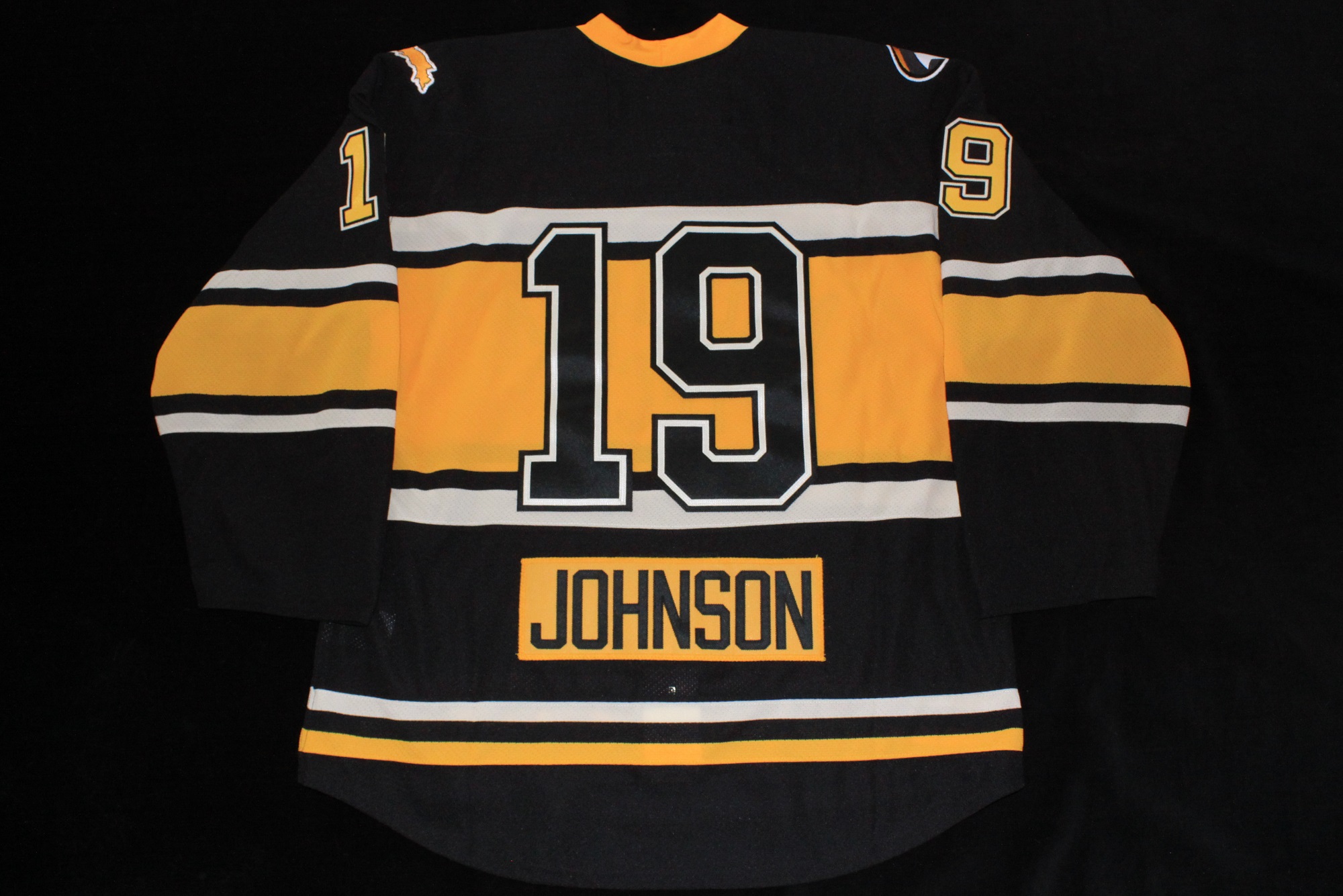
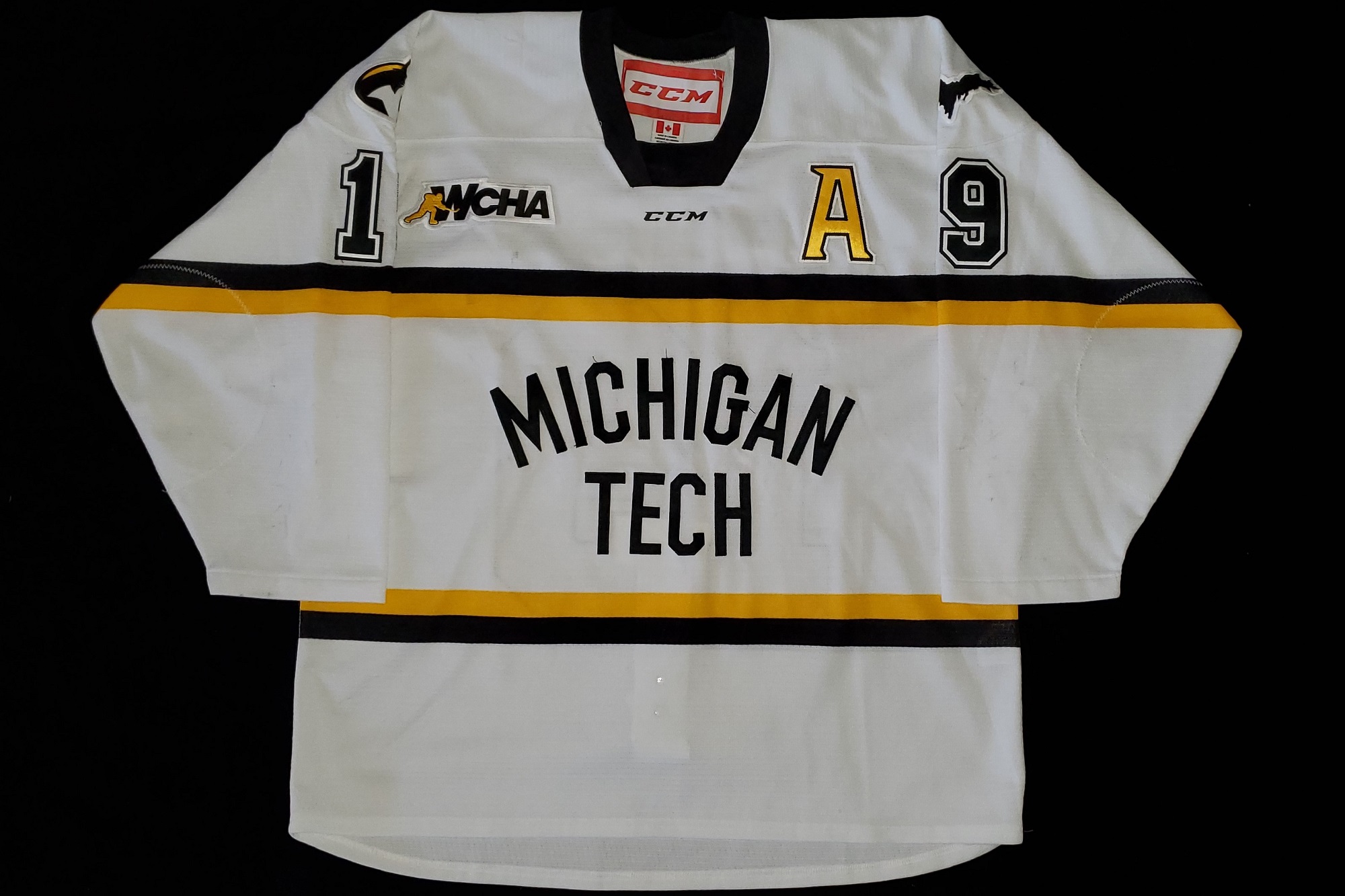
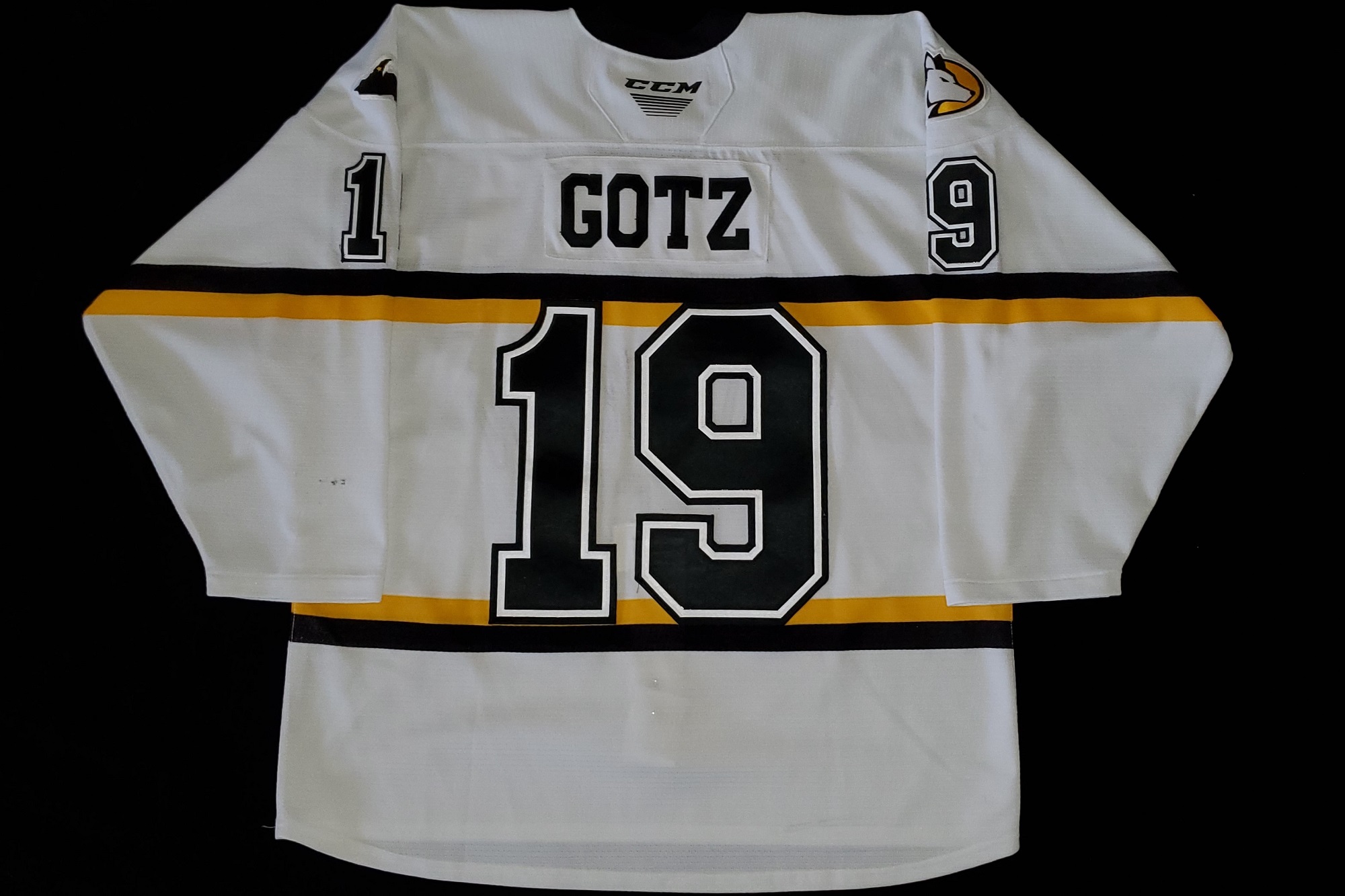
2009-2012
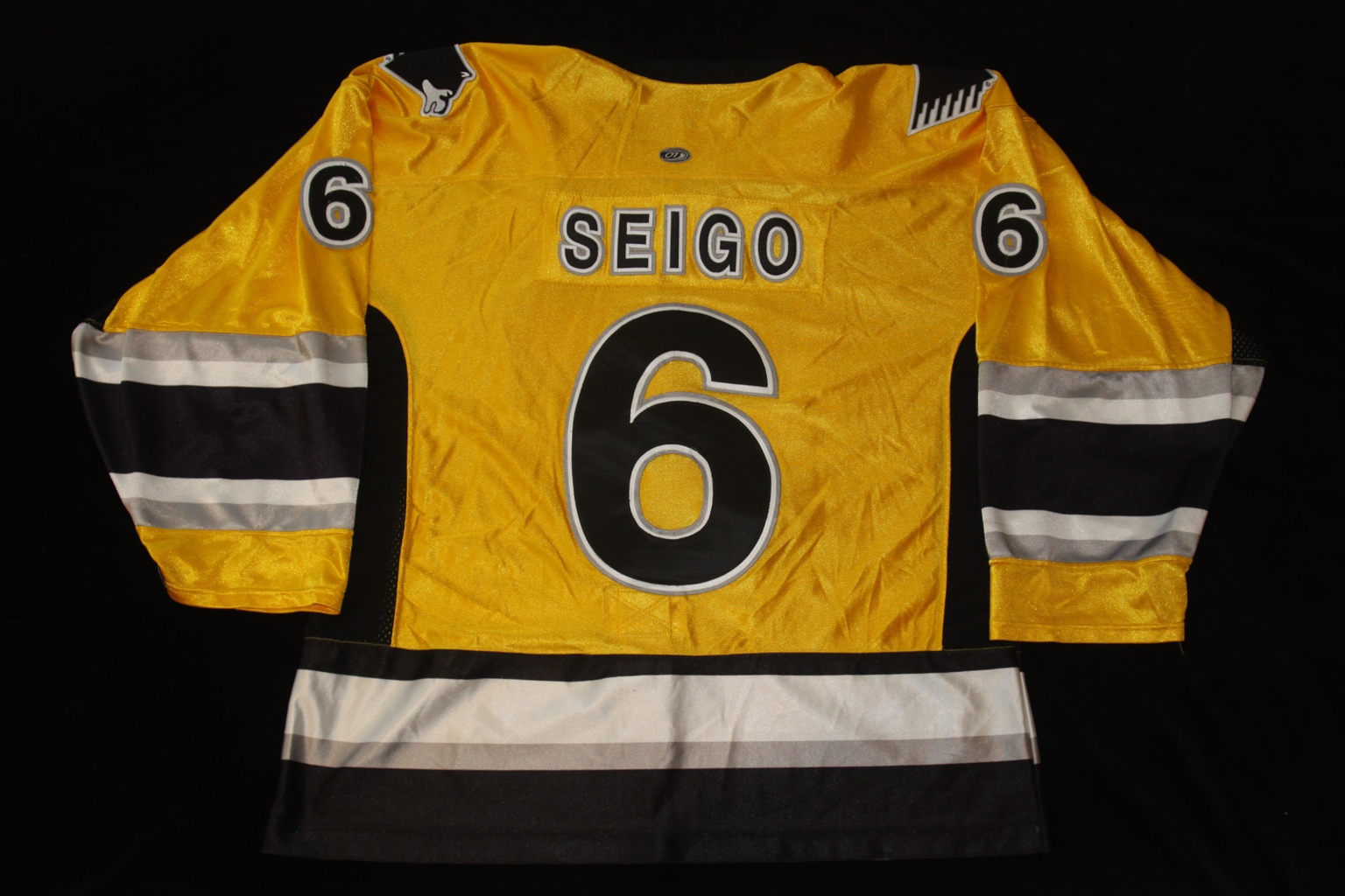
Comments:
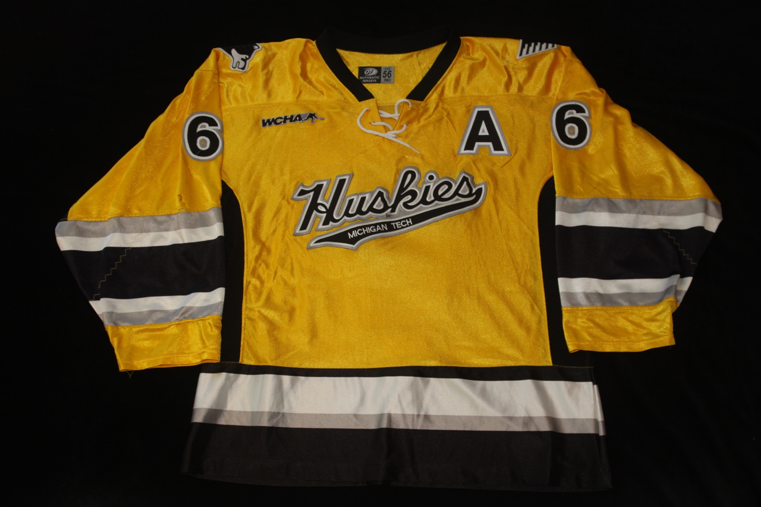
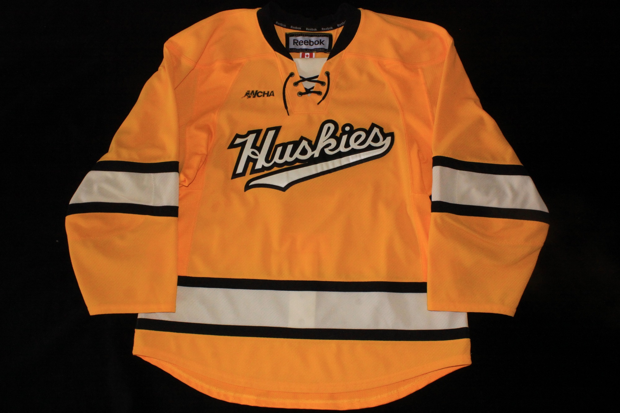
Nearly identical to the previous set of gold jerseys, the only noticeable changes were the addition of “MICHIGAN TECH” inside the tail under the front crest and the change to three color names. OT Sports remained as the supplier. The numbers (3.75" on the sleeves and 11.5" on the back) were done in true three-layer sewn twill, however the original names were done in two-color twill with a third color edging. Replacement names added at a later date were done in three three-layer sewn twill to match the numbers.
The jerseys were an all dazzle construction with the exception of the mesh venting under the arms.
The lace-up neckline and shoulder patches were identical to the previous set.
Close-up Detail Images:
Neck Tag
Goalie Tag
Wash Tag
Fight Strap
WCHA Logo
Back Numbers
Sleeve Numbers
Cresting
Nameplate
Alternate Captain's "A"
Shoulder Patch
2010-2012
Comments:
This would be the last set of jerseys supplied by OT Sports. Nearly identical to the previous set of black jerseys, many of the common design features such as the under arm vending, shoulder patches, and MichiganTech below the neck remained. One noticeable change was neckline which was moderized and now came to a point in the front and included the OT Sports logo. Also the addition of “MICHIGAN TECH” inside the tail under the front crest was done to match the other two sets of jerseys.
The jerseys were an all dazzle construction with the exception of the mesh venting under the arms. The names and numbers (3.75" on the sleeves and 11.5" on the back) were done in true three-layer sewn twill. This set of jerseys was only used for two seasons. Following the 2012 season, Tech replaced all three sets of jerseys and switched to Reebok as a supplier. This marked the first time in nearly two decades that multiple sets of jerseys were replaced at the same time.
Close-up Detail Images:
Neck Tag
Wash Tag
Fight Strap
MichiganTech Logo
WCHA Logo
Back Numbers
Sleeve Numbers
Cresting
Nameplate
Alternate Captain's "A"
Shoulder Patch
Early 2010s Military Tribute Prototype
Comments:
Another jersey which was found on Ebay in 2014. We estimate this jersey was proposed to MTU in the early 2010s based on the crest which appears to be borrowed from the 2009-12 alternates and includes the "MICHIGAN TECH" in the tail of the cresting. This jersey also features the redesigned v-neckline which was first used on Tech jerseys for the 2010-12 road set.
The other design features (shouler patches, neck tagging, fight strap, etc) were very similar to other jerseys of this era. This jersey did not likely get much interest from MTU as there isn't a distinct military presence in the area other than MTU ROTC or military testing conducted at the Keweenaw Research Center.
However, with that being said, it would have been a sharp looking jersey with silver / black / white numbers and names. The other reality which likely kept these jerseys off the ice is that the team would likely have lost money as the Huskies don't have a strong following of fans which collect game jerseys.
Close-up Detail Images:
Neck Tag
OT Sports Logo
Fight Strap
Cresting
Shoulder Patch
WCHA Logo
2012-13
Comments:
A new era of Huskies jerseys began in 2012 with the introduction of three new jersey sets from Reebok. The road black set that was first replaced following only one season of use.
These jerseys modernized the look of the Huskies with the Reebok Edge cut, which was widely used in professional leagues starting in the late 2000s. This meant the end of the more traditional square cut jerseys which had been the standard for several decades. The new Edge jerseys were a more form fitting cut with a tighter fit in the arms and chest along with tuxedo like tails in the rear and a subtle curve to the cut in the front hem as well.
The jerseys featured single color sewn twill cresting, numbers and names (on nameplates). The words "MICHIGAN TECH" were displayed boldly on the jersey front with the player's number in the center. However the most unique additions came on the shoulders of the jerseys. The player's
left shoulder featured on outline of Michigan's UP, with a white star marking the location of Houghton - the home of Michigan Technological University. The player's
right shoulder displayed the school crest, a wide-spread trend in Eastern hockey programs.
There were also a few noticable items missing on the jerseys. The first being the "MICHIGAN TECH" which was shown above the player's name in the
rendering of the black set which was released a few months before the team first wore them on the ice. There was also no use of the conference crest or the "WCHA with skater" logo. The team also removed Reebok patches from the jerseys which were originally on the front just below the neckline. Some fans also celebrated the fact that 2012-13 was the first season since 1993-94 that none of the team's jerseys included the use of the infamous "Piano Dog" Huskies logo.
Close-up Detail Images:
Wash Tag
Fight Strap
Neck Tagging
Shoulder Patch R
Shoulder Patch L
Back Numbers
Chest Numbers
Sleeve Numbers
Nameplate
Jersey Rendering
2012-15
Comments:
This style of jersey was used for three seasons, however it appears many of them were replaced with new jerseys along the way. The original set of jerseys for the 2012-13 season had Reebok patches on the front just below the neckline when the were manufactured (which were removed by the team). The former location of this patch can be seen on some jerseys that were still in use during the 2014-15 season, however this can not be found on many of the jerseys from that final season, suggesting they were not part of the original set.
Similar to the black 2012-13 set these jerseys were Edge style cut and featured the words "MICHIGAN TECH" on the jersey front with the player's number in the center. One key difference was that this set used two color sewn twill for all of the cresting, numbers and name (on nameplate) on the back. The jerseys also shared the same shoulder patches. The player's
left shoulder featured on outline of Michigan's UP, with a white star marking the location of Houghton - the home of Michigan Technological University. The player's
right shoulder displayed the school crest.
The prototype rendering of the white set showed a "MICHIGAN TECH" patch on the back above the players name, however it was never applied. Also the WCHA logo was not present the first year of use. The WCHA modified their logo following the 2012-13 season so this initial omission may have been on purpose awaiting the new logo which was added prior to the 2013-14 season.
Close-up Detail Images:
Wash Tag
Fight Strap
Neck Tagging
Shoulder Patch R
Shoulder Patch L
Captain's "A"
WCHA Logo
Sleeve Numbers
Nameplate
Jersey Rendering
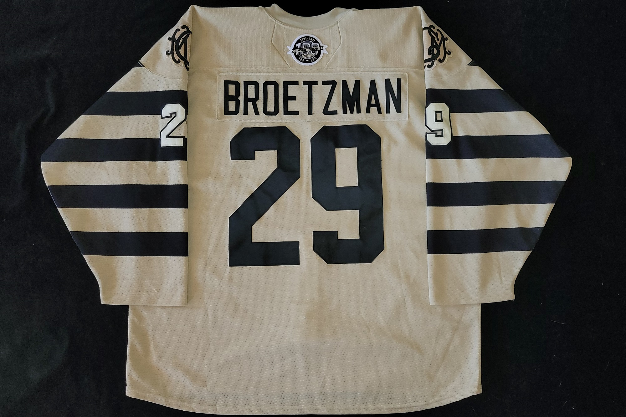
2012-2024
Comments:
The gold alternate jerseys from this era featured the ever popular "Huskies" cresting. The jerseys utilized two color twill numbers on the back and sleeves. The names were done in single color twill on contrasting color nameplates. These jerseys also started without the WCHA logo on the right chest, but it was added at a later date. The gold jerseys seem the be the only initial Reebok set which retained the "MICHIGAN TECH" patch on the back of the neck.
On Jan 2, 2018 the players wore these jerseys with patches celebrating the first season of the Little Ceasar's Arena. Some of the newer players (Smith, Brice, Beretta) had jerseys with the WCHA logo embroidered lower and as a result they wore the LCA patch to the player's right of the WCHA logo, rather than directly below it as did most of the other players. These patches were stripped off the jerseys after their lone appearance at the GLI. Michigan and Michigan State also wore the patches at GLI, however BGSU who was the invite team that year, did not.
Close-up Detail Images:
Cresting
Sleeve Numbers
WCHA Logo
Neck Detail
Reebok Rendering
Detail images courtesy of
@MTUEquip X Account
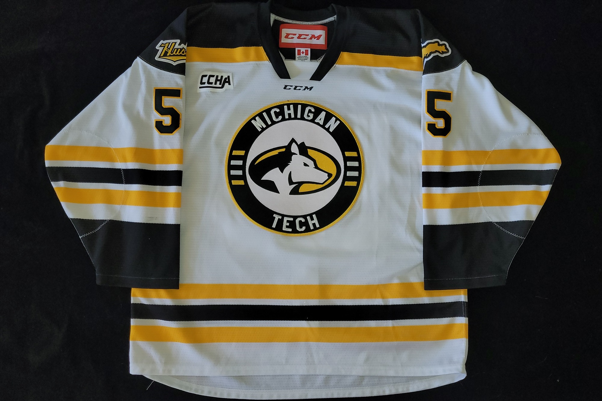
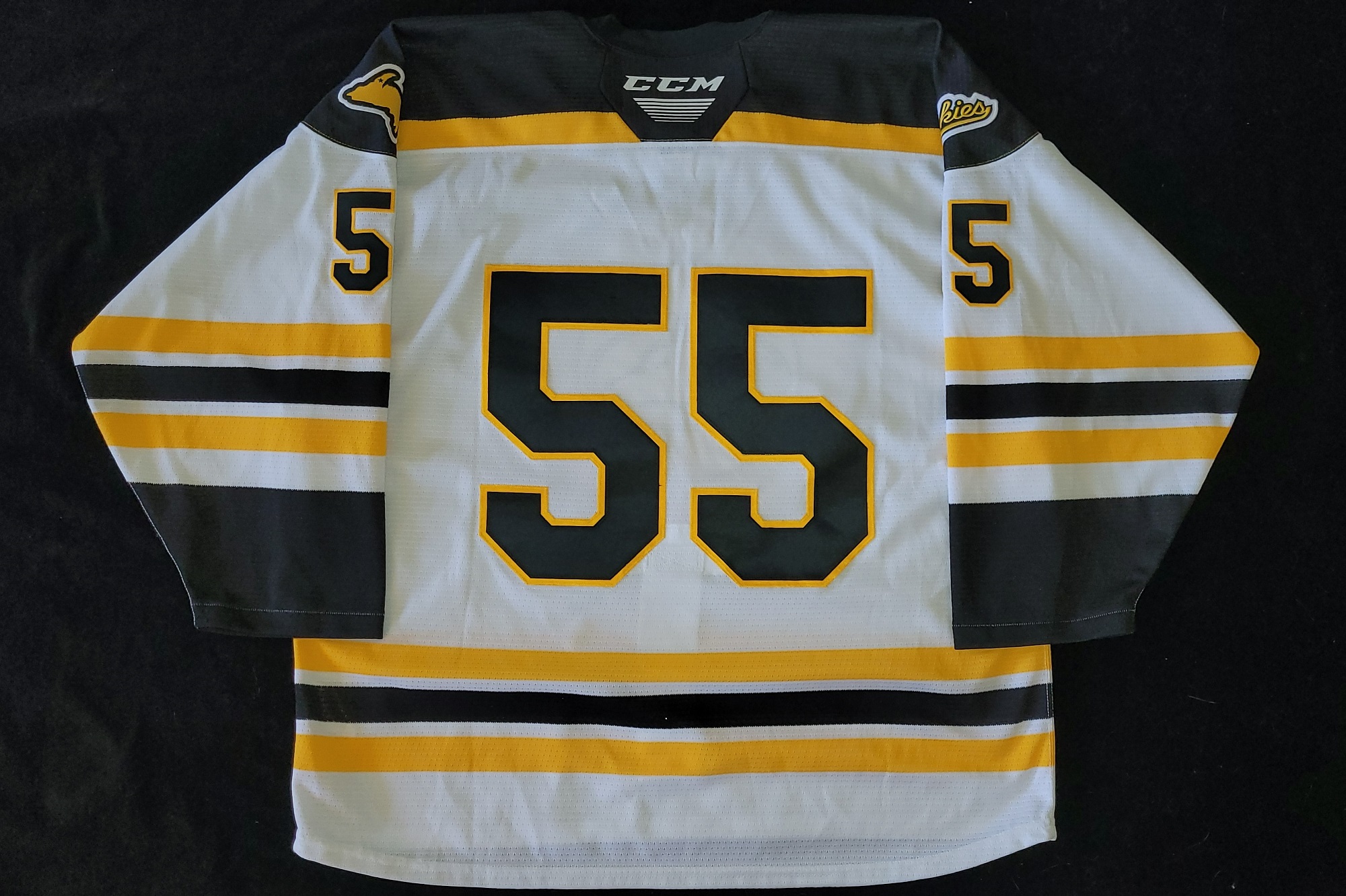
Unknown - 2024
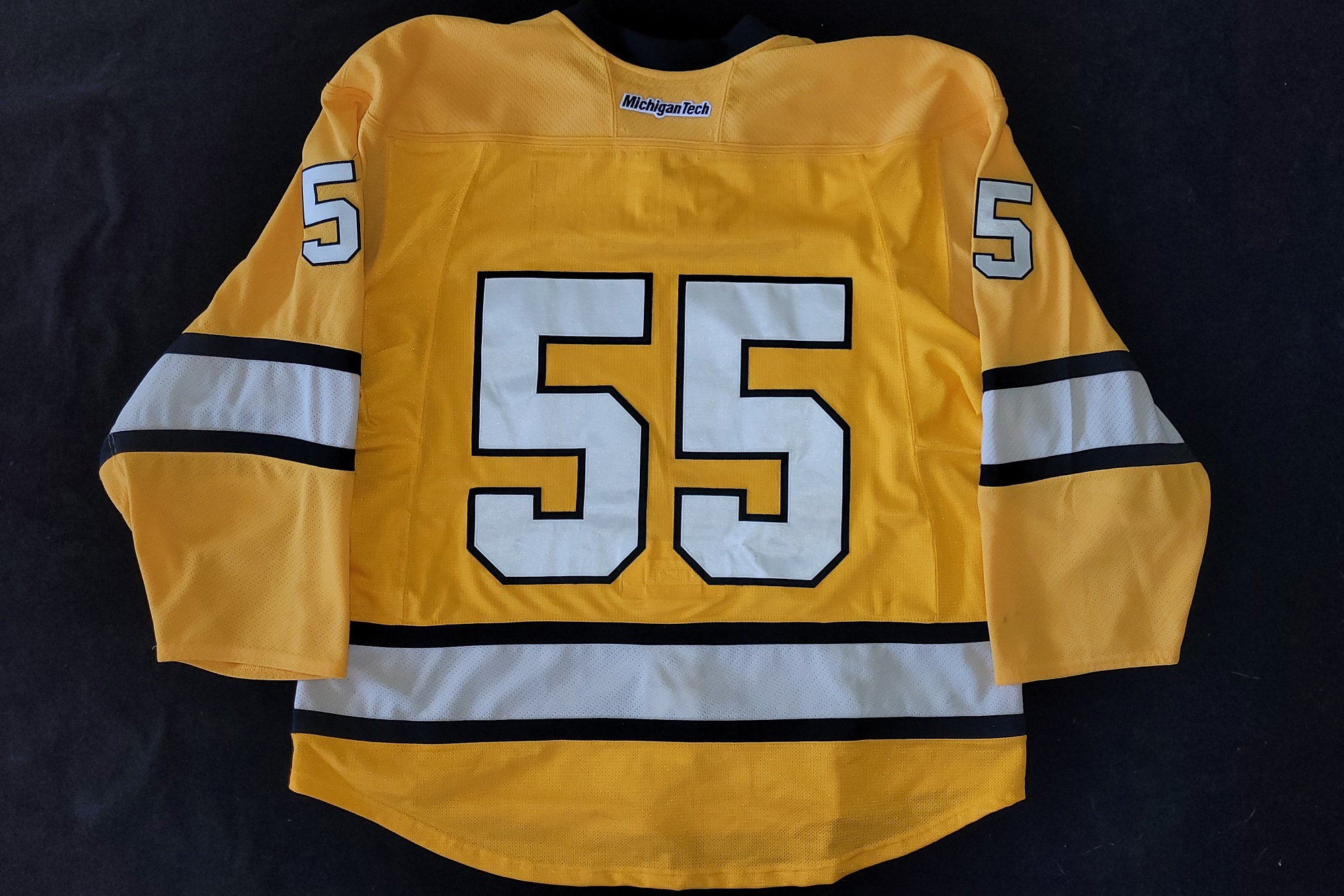
Comments:
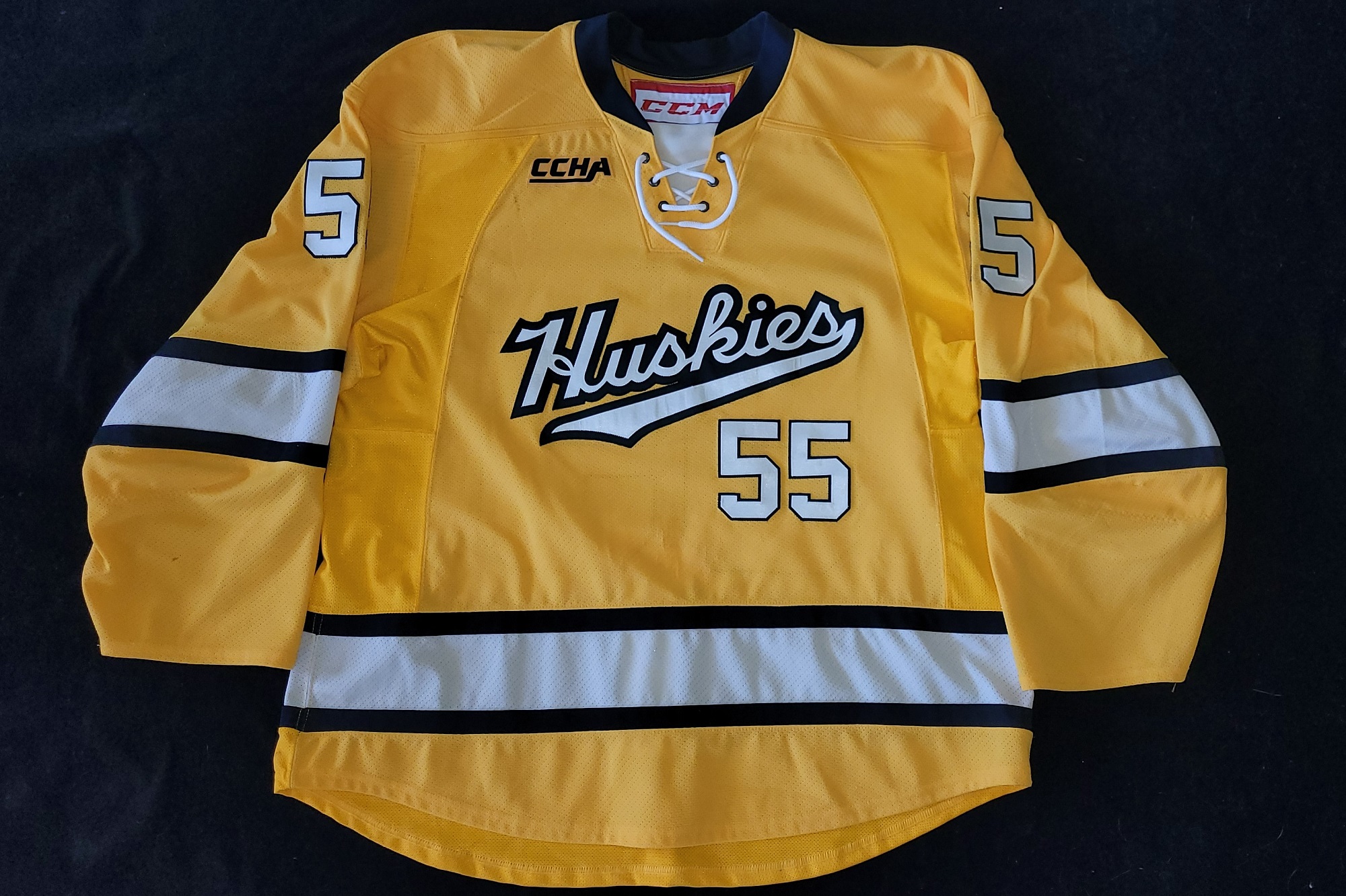
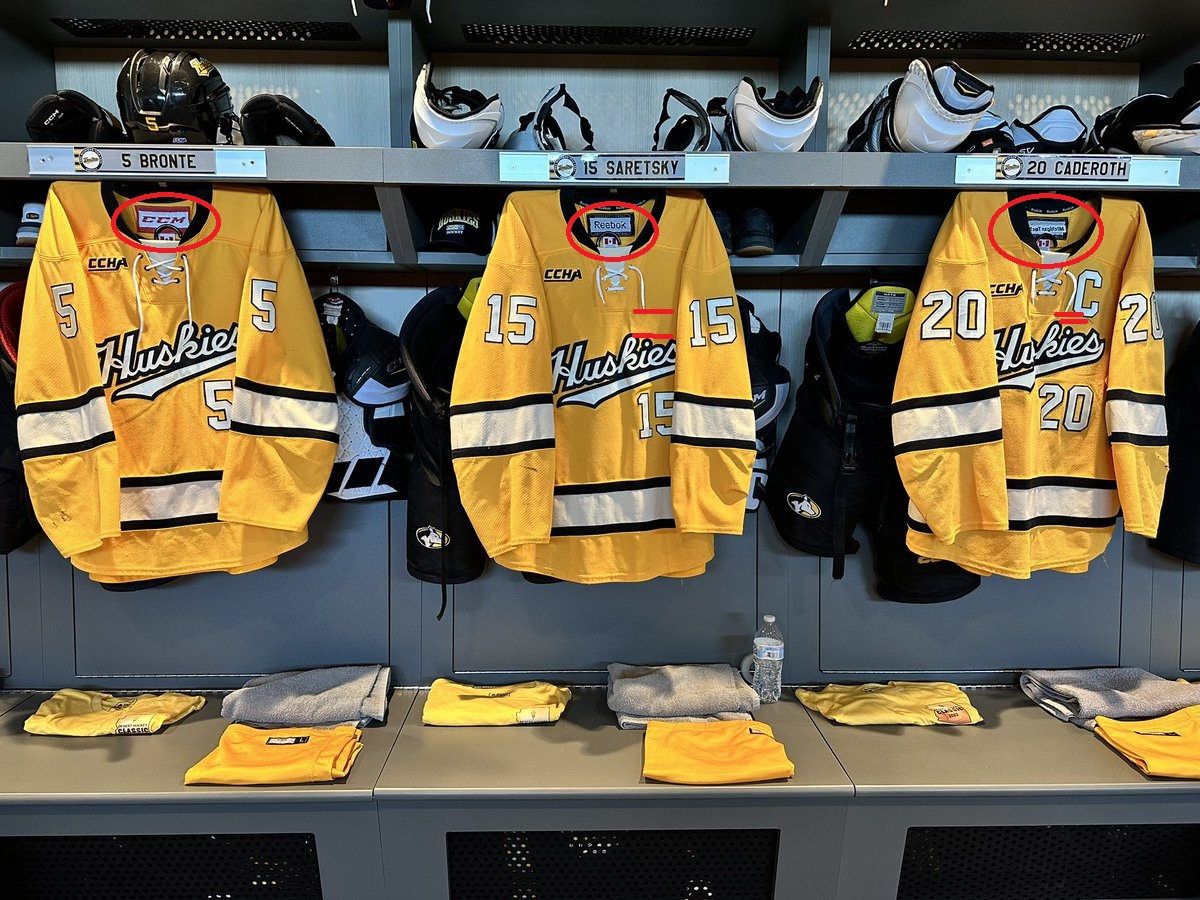
Starting in 2012, Michigan Tech switched to the Reebok Edge jersey template for their gold jerseys, similar to their white, black and cream jersey sets at time time. After more than 10 years, this patchwork set is still worn on the ice. Jerseys were subtracted by players who left the program and added for incoming players. At some point, the branding of the replacement jerseys switched to CCM as shown by the jersey at the left. This happened no later than 2020 as this #55 jersey was prepped with the WCHA conference logo before it was ultimately covered with a CCHA patch when it was numbered / lettered and worn for the 2021-22 season by Tyrone Bronte.
Some of the Reebok branded jerseys were still being worn at the 2022 Desert Classic at Arizona State Univ. This image of jerseys in the player stalls (lower left) clearly shows three different variations of the jersey all being used. An older Reebok jersey in the center shows that the "Michigan Tech" on the back of the neck was embroidered before the neck tagging was added, where as a later Reebok jersey to the rights shows the embroidery through the neck tagging.
The newer jerseys, Reebok and CCM branded, have had the crest locations moved as well. This difference is particularly noticable when comparing the #15 and #20 jerseys when referencing the bottom of the lace-up neck hem line. The outer (newer) jerseys also utlize darker eyelets for the neck lacing. Also notable in this image is the font used for the numbers. The 5 on the left and center jerseys are different. While it is unlikely any of these variations are noticed by the fans in the seats at game speed, they certainly add even more character to this long lived set.
Lack of replacement budget? Team tradition? Player superstition? Who knows why this set continued to evolve as it did. Following the 2023-24 season, this set was finally retired bringing an ended to the longest run of any jersey style (by far) in modern Michigan Tech Hockey history.
Close-up Detail Images:
Cresting
Neck Detail (Front)
Neck Detail (Back)
CCHA Logo
WCHA Logo (Interior)
Sleeve / Front Numbers
Back Numbers
Fight Strap
Neck Tagging
Wash Tag
2013-17
Comments:
The Huskies debuted new road jerseys to open the 2013-14 season. Modeled after the Boston Bruins, the jerseys featured gold and white striping on the sleeves on body hem. they also featured gold shoulder yokes with white highlights at the bottom. The jerseys retained the same style of shoulder patches which the team adopted in 2012 - a map of Michigan's upper peninsula on the player's left shoulder and the Michigan Tech crest on the other shoulder.
The names and numbers were done in three color sewn twill using the same font as the Bruins jerseys. The front of the jersey featured the newly designed WCHA logo, a small Reebok patch and a lace-up neck line.
Close-up Detail Images:
Wash Tag
Fight Strap
Neck Tagging
Goal Cut Tag
Shoulder Patch R
Shoulder Patch L
Front Crest
WCHA Logo
Lace-up Neck
Sleeve Numbers
Nameplate
Jersey Rendering
2013-18
1962 Championship Throwbacks
Comments:
New throwback jerseys were unveiled for the 2013 Great Lakes Invitational hockey tournament. For the first time, the games were played outdoors at Comerica Park in Detroit, MI. These retro throwback jerseys became the fourth jersey set for MTU in the 2013-14 season. This marked the second time in team history the team wore four different jersey designs in the same season, with 1993-94 being the first.
The jerseys were produced by Reebok in the Edge style of the day and a small Reebok logo patch was placed directly below the lace-up neckline. To support the vintage look the cresting was switched a single color black sewn twill, however the shape of the logo remained with the current style which has been used since the mid-60s. It would have been nice to see the jerseys feature the early 1960's style of the Huskies cresting - maybe next time.
The jersey body and gold striping were an air-knit material while the black strips were a much tighter polyknit. The numbers were applied in single color black sewn twill. Names were also done in single color twill, but they were done in an inverse color scheme featuring white lettering on black nameplates. By the time the set was retired following the 2017-18 season, a small embroidered WCHA patch was added to the jerseys. But this was not added until the GLI tourney which rang in the 2018 New Year. This was also the first year the GLI was played at Little Ceasars Arena and the three Michigan teams wore the same LCA inaugural season patch the Red Wings had on their jerseys. (BGSU, the invite team that year, did not wear the patch.)
These patches were also worn the following weekend at the Las Vegas Invitational and then stripped off the jerseys when the team returned to Houghton. In a further loss of historical accuracy, as a cost saving measure, the team removed all the black neck laces and nameplates from this set of jerseys and resused them on a new set of nearly identical CCM jerseys for the 2018-19 season. It was unfortunate to see the jerseys stripped down to save a couple hundred dollars.
Close-up Detail Images:
WCHA Patch
Reebok Patch
Cresting
Back Numbers
Sleeve Numbers
Neck
Neck Tagging
Wash Tag
Striping Width
Fight Strap
Captain's Letters
Jersey Reveal Photos
Courtesy of MTU
Kero Front
Kero Back
Kero Side
2015-19
Comments:
Starting in 2015 and ending with the close of the 2018-19 season, the home jerseys were matched up to the road set to feature the circular crest. Much of the jersey design (striping, name/number font, etc) was patterned after the jerseys worn by the Boston Bruins (who were also supplied by Reebok) at that time.
The numbers were done in three color sewn twill (black on gold with white "kiss cut" edging) where as the lettering was done in two color twill (gold "kiss cut" on black). Some variations were found in the nameplates that were replaced for the 2017-18 season. The nameplate material was a tight knit that did not match the jersey body and the names were done in traditional two-layer black on gold layering.
This #28 jersey was worn by Brent Baltus from 2015-18. Brent played parts of five seasons for the Huskies logging a total of 133 games. Baltus wore an "A" for the 2016-17 season and later the "C" for the 2017-18 season which was ultimately removed when the jersey was recycled.
The front of the jersey featured the newly designed WCHA logo, a small Reebok patch and a lace-up neck line. The shoulder patches remained the Michigan Tech crest and map of Michigan's upper peninsula.
Close-up Detail Images:
Neck Tagging
Goalie Tagging
Fight Strap
WCHA Logo
Reebok Logo
MTU Seal Patch
UP Patch
Sleeve Numbers
Back Numbers
Nameplate (2017-18)
Nameplate (2018-19)
Nameplate Comparison
Nameplate Comparision
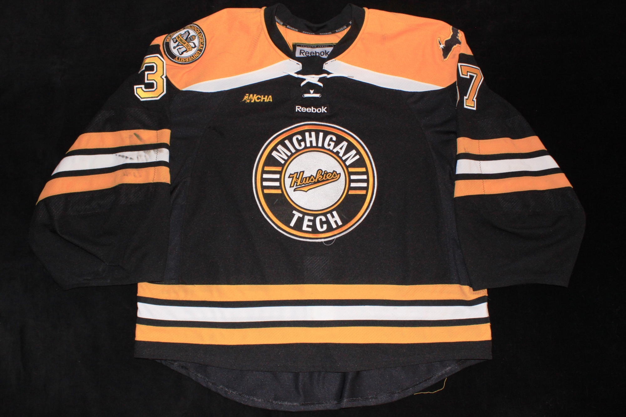
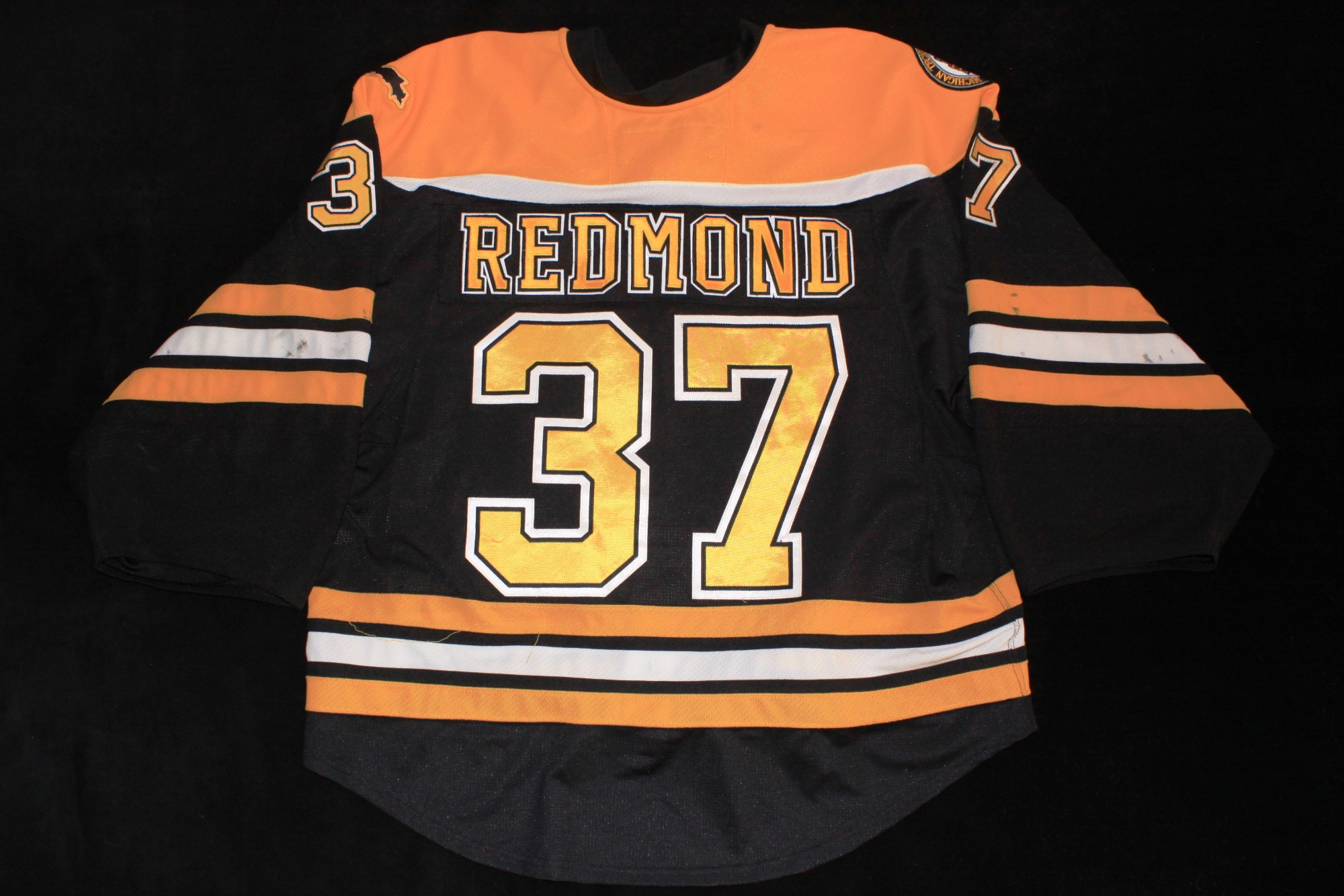
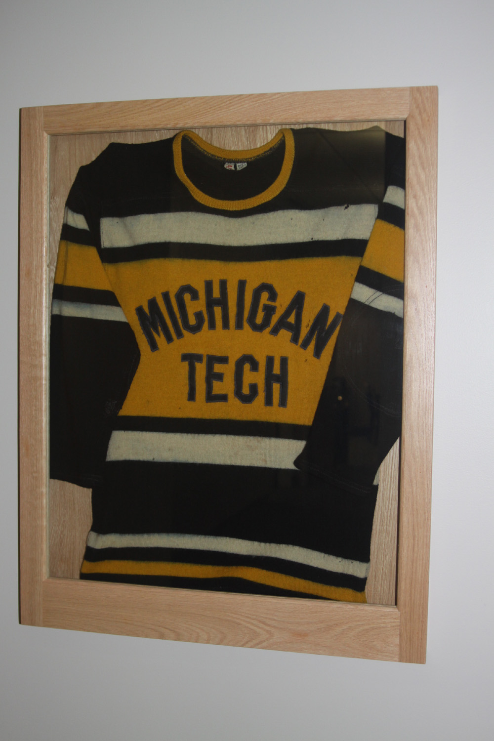
2017-2022
Comments:
The 2017 season brought a new coaching staff and a new throwback jersey as well. This new road jersey was inspired by one worn during the
1932-33 season.
An example of this vintage jersey is framed up and displayed at the John McInnes Student Ice Arena behind the suites.
These jerseys were the first branded as CCM since the early 1990s. A small CCM patch was applied directly below the neckline on front of the jerseys, just below and to the right of the WCHA logo which was embroidered in gold directly to the jerseys. One modern update to the design was that they retained the use of the Bruins font for the sleeve numbers. They were two layer sewn twill with a black "kiss-cut" edging between them. The back numbers were two color sewn twill. The player's name was single color black twill on a contrasting gold nameplate placed below the numbers in a nod to the style of many decades prior.
The shoulders sported embroidered patches of the now common map of Michigan's upper peninsula on the players left shoulder and the opposite debuted the new Husky logo which was unvailed by Tech at the end of the previous season.
This jersey is not game worn, but was made to team specs. In my opinion this was one of the nicest jerseys Tech has worn in decades and I didn't want to wait the better part of a decade to own a game quality jersey of this style.
Close-up Detail Images:
Sleeve Numbers
Captain
Captains (Group)
Nameplate
Shoulder Patch R
Shoulder Patch L
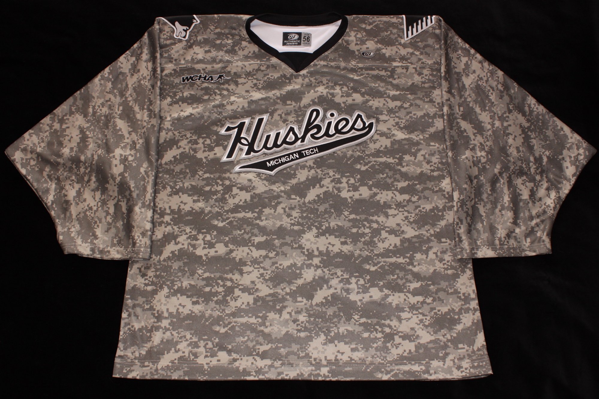
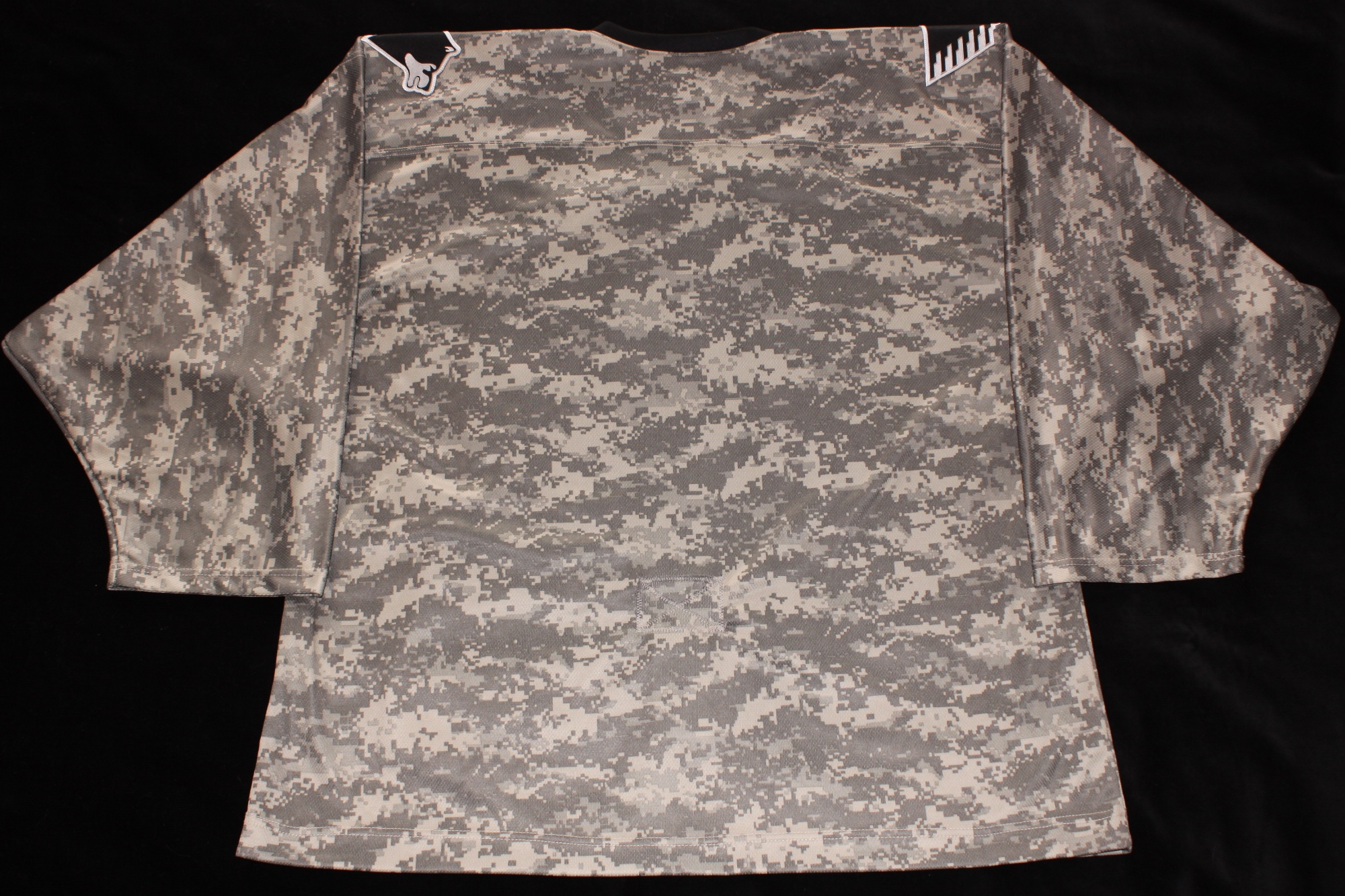
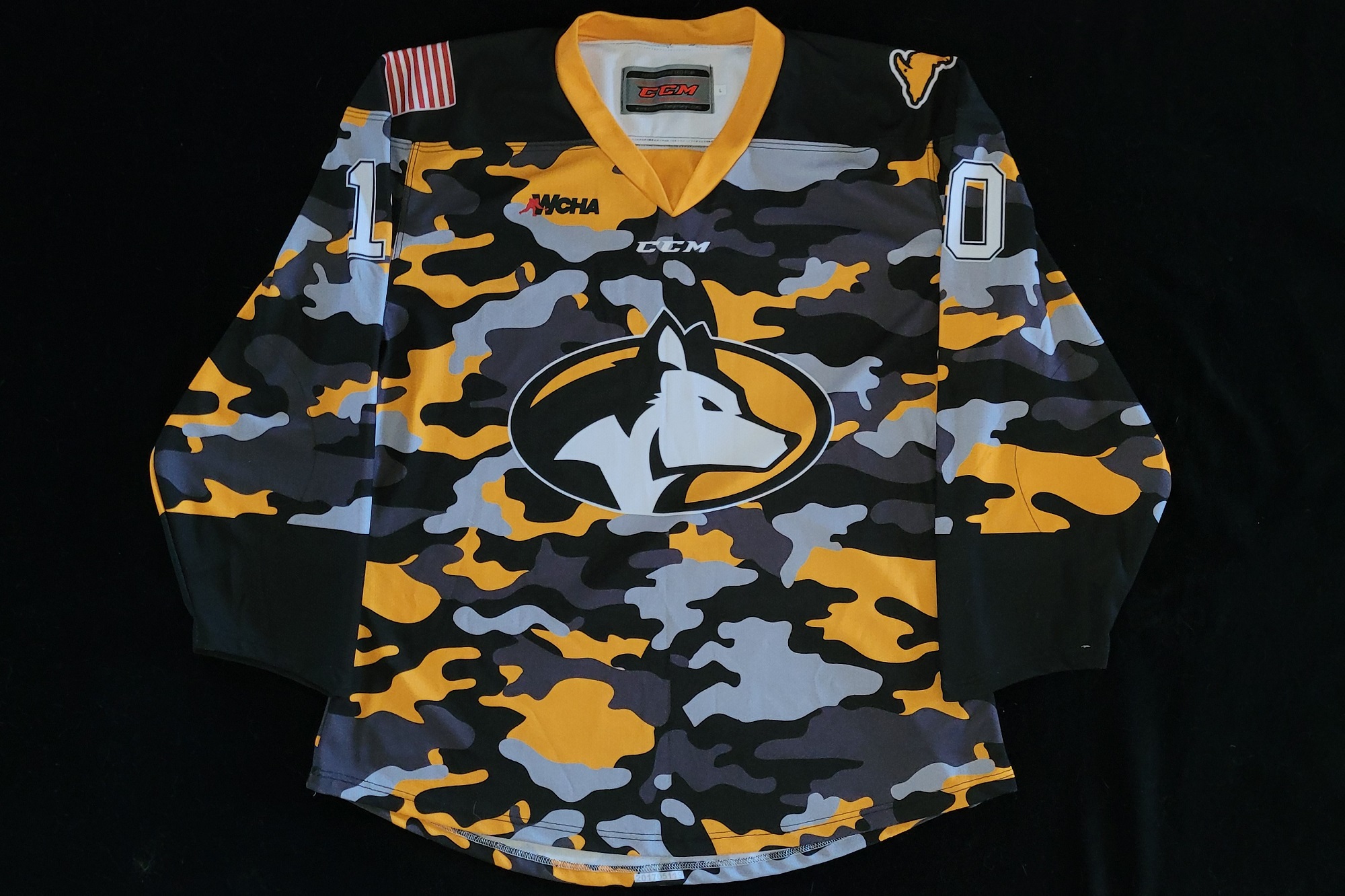
Military Tribute 11-10-17
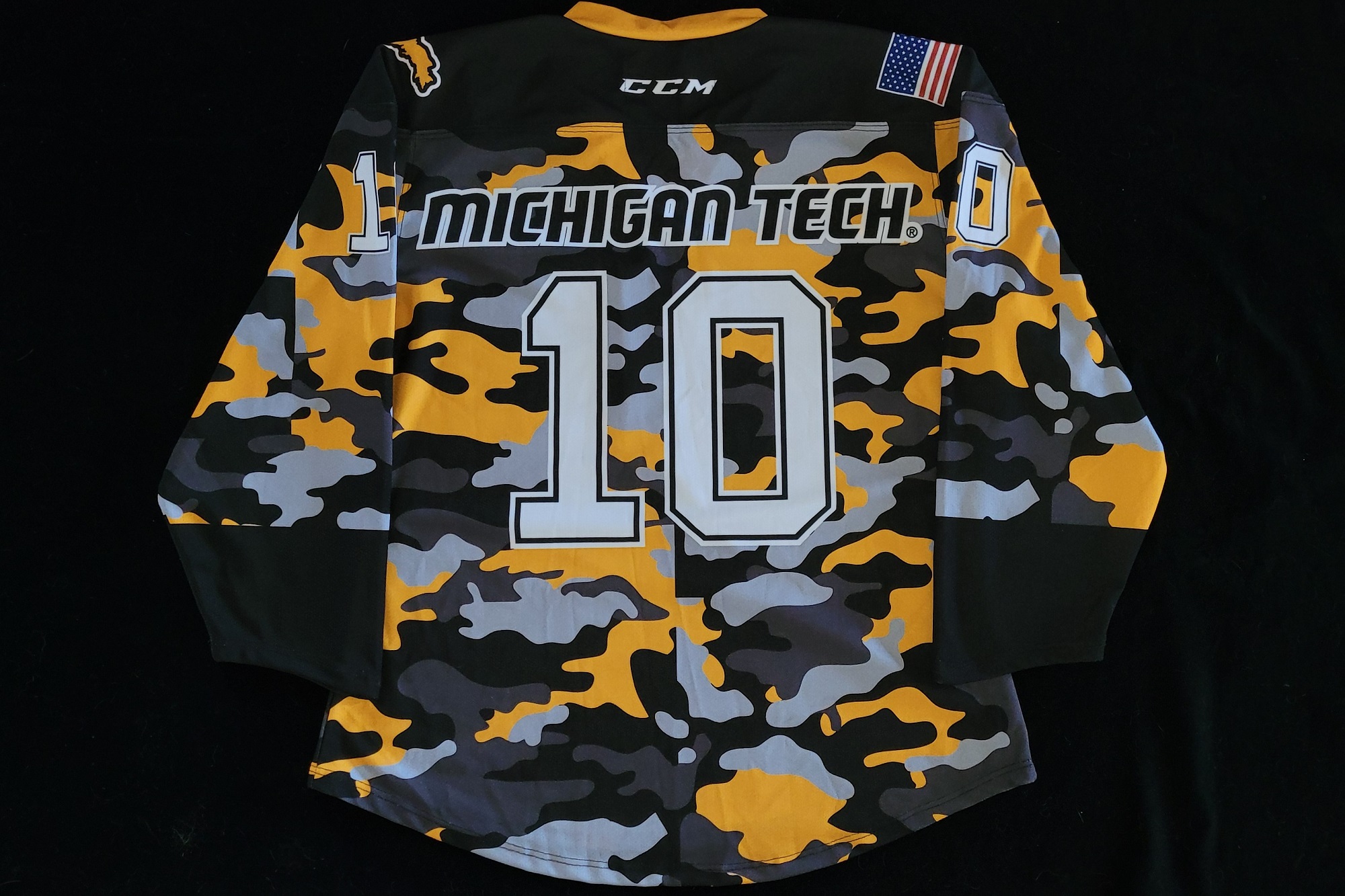
Comments:
To honor active military and veterans, Michigan Tech wore these special camouflage theme jerseys vs the Northern Michigan Wildcats on 11-10-17. John French, who was a former Huskies player (1993-94) and wounded warrior was honored during the game and dropped the puck with his children in a special pregame
faceoff.
The jerseys utilized fully sublimated construction. Besides the black-gold-grey camo pattern for the jerseys, the other first was that the jersey featured the new Huskies logo for the primary crest. The left shoulder featured the now familiar map of Michigan's UP. The US flag was placed on the right shoulder, however as a few fans noted prior to the game, the flag was incorrectly presented with the stripes leading. This was an unfortunate error for a military tribute jersey.
The CCM logo was placed on the back of the neck and directly below the front neck. The WCHA logo was present on the right chest of the game jerseys. A few extra jerseys were made as well for
Blizzard T. Husky, former player
John French,
etc. Unlike the game jerseys, they did not have the WCHA logo on the front.
Rather than the players' names, the jerseys had MICHIGAN TECH placed above the numbers on the back of the jerseys. This was because the jerseys were to be sold via silent auction during the game to raise money for Copper Country Veteran's Association. As a result, it unlikely many of these one game wonders will find their way into the hands of collectors.
Close-up Detail Images:
Images courtesy of Michigan Tech Hockey
Front View
Back View
Back Neck
Front Logo
Neck Tagging
Shoulder Patch R
Shoulder Patch L
Highlights Screen Grab 1
Highlights Screen Grab 2
Highlights Screen Grab 3
Highlights Screen Grab 4
2018-Present
Comments:
In 2018 the team replaced the previous set of cream throwback jerseys which had been worn since 2013. This set of jerseys had some minor revisions. The material now a ligher weight, tighter knit material and the stripes of the jersey were part of the knit pattern rather than seperate sections of material as they had been on the previous set. This set of jerseys was also branded as CCM below the neckline on the front of the jerseys. The rear "tail" of the jersey was much shorter and the front tail was eliminated completely. Overall the jersey was much more of traditional square cut with oversized sleeves, moving away from the Reebok Edge template.
The jersey shown at left was one of the jerseys ordered through
Tech Hockey Guide.
Our thanks to them for making this jersey available for photography. Although not shown on this yet to be lettered/numbered jersey, the team did stay with single color twill numbers and single color twill names on nameplates. In an odd move, the team elected to remove the nameplates of all the returning players from the previous set of jerseys and reuse them on the new set as shown by this photo from the @MTUEquip Twitter account of the staff
starting the nameplate removal.
Close-up Detail Images:
Body Striping
Front Crest
Neck Tagging
Wash Tagging
Neckline
WCHA Logo
Fight Strap
Copper Country Strong 11-24-18
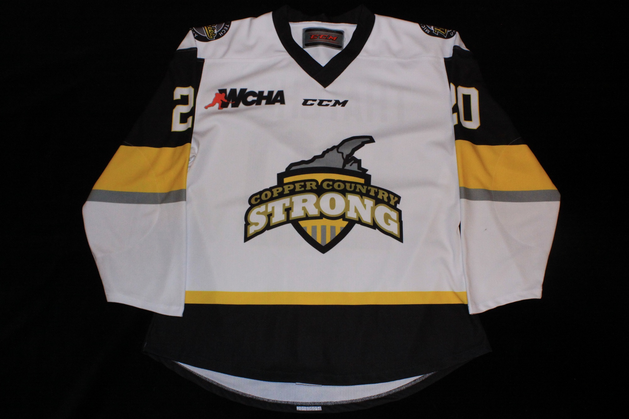
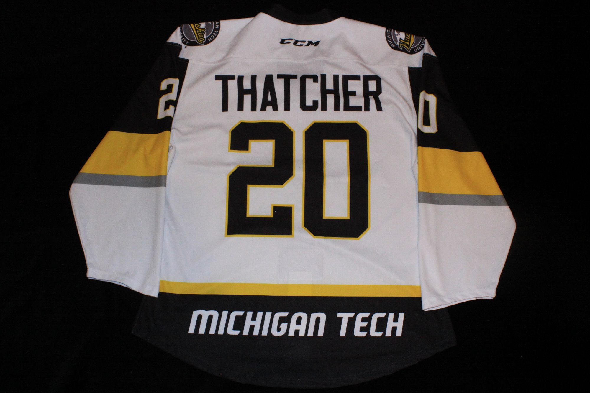
Comments:
On the night of June 16, 2018 the cities of Houghton / Hancock and the surrounding Copper Country region were devastated by torrential rain. More than six inches of rain fell and resulted in what many termed to be a thousand-year flood event. During the storm, a young boy named Thatcher Markham became trapped in his basement. While he was able to rescued from his flooded home and air lifted to downstate Michigan for medical care, Thacher passed away a few days later on June 18th.
Twelve-year-old Thatcher played goalie for his hockey team and his cousin, Devin Karo, was a netminder for the Michigan Tech Huskies (2014-19). The family had close ties to the Michigan Tech Huskies hockey program for many years with Devin's uncle Ryan Markham having played for the Huskies (2001-05) as well as Devin's brother Tanner Kero (2011-15) and his cousin Blake Pietila (2011-15). The Markham family and Thatcher's cousin Devin Kero and dropped the puck for the ceremonial
faceoff
(Photo by MTU). Devin also tended the net that night for the Huskies, making 20 saves in a 2-1 win over the visiting Alaska Nanooks.
As was done the previous season, the jerseys were fully sublimated construction. The front of the jersey featured the Michigan Tech designed Copper Country Strong logo which the team had worn that season as a helmet decal. All of the game jerseys bore the name of Thatcher on the back in his memory. The CCM logo was displayed on both the front and the back of the jersey neck. An oversized WCHA logo was placed on the players right chest. Both shoulders featured one of the newer alternate logos with the familiar script Huskies across a map of the Keewenaw encircled by Michigan Tech University. The lower, back hem of the jersey displayed MICHIGAN TECH.
The jerseys were auctioned during the game although the 2018 event bidding was expanded via the team's Facebook page allowing those not able to attend the game to bid as well.
Close-up Detail Images:
Front View
Back View
Thatcher Nameplate
Shoulder Logos
Faceoff Photo
CC Strong Logo
2019 - 2021
Comments:
In 2019 the home jerseys were matched up to the road throwback set. The home design had less striping, providing a cleaner look. The jerseys also reverted to a more traditional "square cut" and were branded with heat pressed CCM logos on the front and back near the neckline. Similar to the black set, the latest Husky athletics logo and UP profile remained as the shoulder patches. The numbers were three-layer multi-color sewn twill but the name lettering was single color on a nameplate. There were slight variations between the first and second year nameplates depending on if they were a new jersey for the second season or simply recycled with a new nameplate.
The enlarged WCHA logo was embroidered on a patch with Huskies gold for the "W" and black for the remainder, matching the team specific multi-colored designs many other WCHA teams were using. Marking the end of a conference with 70 years of history, these were the last Huskies jerseys to be seen with the WCHA logo. The other WCHA era sets recycled into 2021-22 were patched over with CCHA logos or did not display a conference logo.
The #23 jersey was modeled for the jersey release announcement by 2019-2020 captain Raymond Brice
front and
back.
The photo shoot was done in the lockerroom with his other jerseys as a backdrop showing off all of the current Huskies jerseys at that time. Another unique addition with these jerseys were white helmets which had not been worn for about a decade.
Close-up Detail Images:
Left Sleeve
Shoulder Patches
Images courtesy of
Michigan Tech Hockey
Lend a Paw 01-10-20

Comments:
Supporting a year long charity effort, on January 10, 2020 the Huskies wore these jerseys while taking on the Bowling Green Falcons. Michigan Tech pulled within one goal of BGSU with about 10 minutes remaining in the game but ultimately fell short, losing 3-2 that night. The event generated winning bids totalling $5,575 with Blizzard's mascot jersey getting one of the two top bids at $300.
Similar to the previous two years, the jerseys were a CCM fully sublimated construction. The Lend a Paw logo served as the main crest on the front of the jersey, with "HUSKIES" in the modern font directly above the logo. A single color, black WCHA logo was placed on the right chest. The back of the jersey featured the logo for the Big Brothers Big Sisters of the Western UP above 11" tall numbers with "MICHIGAN TECH" on the lower back. The current oval Huskies dog logo was displayed on both shoulders.
Overall, these jerseys were a bit of a disappointment compared to the previous years' jerseys as the design didn't take advante of the main benifit of sublimated construction - unlimited creativity. The most glaring examples were the numbers done in solid black, block font with no edging of any kind and the single color WCHA logo. It would be nice to see the team do something a little more out of the ordinary such as the curved striping on the side of the jersey or adding a unique number font with multiple colors to give the jerseys a little more "pop" on the ice.
The jerseys were auctioned live during the game and bids were also accepted through the team's Facebook page. However this year, the online bidding was ended 15 min before the live bidding at the rink, once again putting remote alumni at a disadvantage. It would be nice to see the team allow some of the jerseys to be put into a true online auction format as it would lead to less frustration and likely higher bids from far away Huskies fans. For example auction the players dressed for the game in-house and the jerseys of the players out of the line-up and Blizzard online the following week.
Close-up Detail Images:
Full Sleeve
WCHA / Neckline
Neck Tagging
Shoulder Logos
Back Numbers
Sleeve Numbers
2020 - 22
100th Anniversary Throwback
Comments:
One hundred years... That's a lot of hockey and that's the milestone Michigan Tech arrived at during the 2020-21 season. To celebrate their 100th season, the Huskies went waaaay back to a jersey design
attributed to the 1926-27 season.
Per the team's website "The design was inspired by the uniforms worn by the 1926-27 Michigan College of Mining & Technology Huskies." Drawing details from the few old photos,
such as this one from 1927
that were available from that long gone era, this modern version of that style was created.
The crest for the jersey was done in two parts - the first being a large patch featuring an image of a tongue wagging Husky and the second part being "HUSKIES" arched over the patch in individual sewn twill letters. Each shoulder bears a patch of the intertwined script letters "M C M" which replicates even older Michigan College of Mines logo circa 1903.
The 100th anniversary logo was presented as an embroidered patch on the back of the jersey just above the player's name. The back numbers and name (on nameplate) were done in single color sewn twill, while the sleeve numbers were done in two-color sewn twill to help them stand out from the striped sleeves.
While a CCM logo was heat pressed below the neckline on the front of the jersey, noticeably absent from the jersey was the WCHA conference logo. The team wore these for the 70th and final season of the men's WCHA conference and wore them again in 2021-22 season when the Huskies restarted the CCHA with six other WCHA members and the University of St Thomas as the eighth member.
Close-up Detail Images:
100th Patch
Shoulder Patches
Jersey Crest
Sleeve Numbers
Nameplate
Captain's "C"
Back Numbers
Fight Strap
Neck Tagging
Wash Tag
CCM Template
2022 - Present
Comments:
On a Tuesday evening (2/1/22) Tech debuted this jersey. This game against NMU, like quite a few in that era, had to be rescheduled due to players testing positive for Covid. The jerseys arrived very late due to supply chain issues caused by the same global pandemic. Fans had waited a long time for the new athletic logo to find its way on to the front of a jersey. Other than a brief one game appearance on the military tribute camo jerseys in November 2017, it took almost six years for Piano Dogs successor, which was revealed in March 2016, to become the crest on one of Techs primary jerseys.
This design essentially recycled and tweaked the features of the two most recent home jerseys. The 2015-19 round crest white provided the striping template, shoulder yoke and round crest. The throwback white worn 2019-21 used the same font for the names and numbers (now two color sewn twill). The circular crest border is larger than the previous version allowing for a bolder MICHIGAN TECH and more space for the oval "Pensive Husky" logo. Long-time fans appreciated the Huskies patch on the shoulder and the UP patch on the opposite shoulder had become a staple of recent jerseys.
It is unfortunate the team didn't get more creative with the lettering as a sans serif font would have complimented the round crest and oval logo. The use of gold outline color on a white jersey also doesn't really do much at a distance as it lacks contrast. Maybe next time... As they say, it is never too late to make a better decision.
Close-up Detail Images:
Crest
Nameplate
CCM Template
Detail images courtesy of
Michigan Tech Hockey
2022 - Present

Comments:
Michigan Tech continued a recent trend of rival game releases and first wore these new road jerseys at Northern Michigan on December 2, 2022. This design was an evolution of the previous road throwback worn 2017 2022 now using the CCM Quicklite template like the home jerseys. The biggest changes were the removal of the body striping on the backside of the jersey and moving the nameplates (still black lettering on contrasting gold plates) to a more modern location above the numbers. I am sure many opposing team play-by-play commentators rejoiced at this change.
The shoulders retain similar patches as the previous set with the oval Husky on the players right shoulder and a revised Michigan upper peninsula map patch highlighting Houghton on the left shoulder. As part of the template change the CCM remained below the front neckline but was now above the striping. CCHA conference logo placed on the right chest. The CCM logo was present on the back of the neck.
Close-up Detail Images:
Coming soon...
Screen grab courtesy of
@mtuhky Twitter feed
2024 - Present